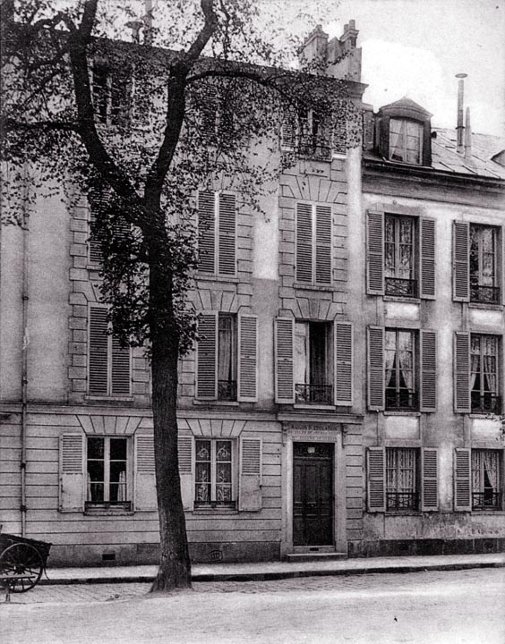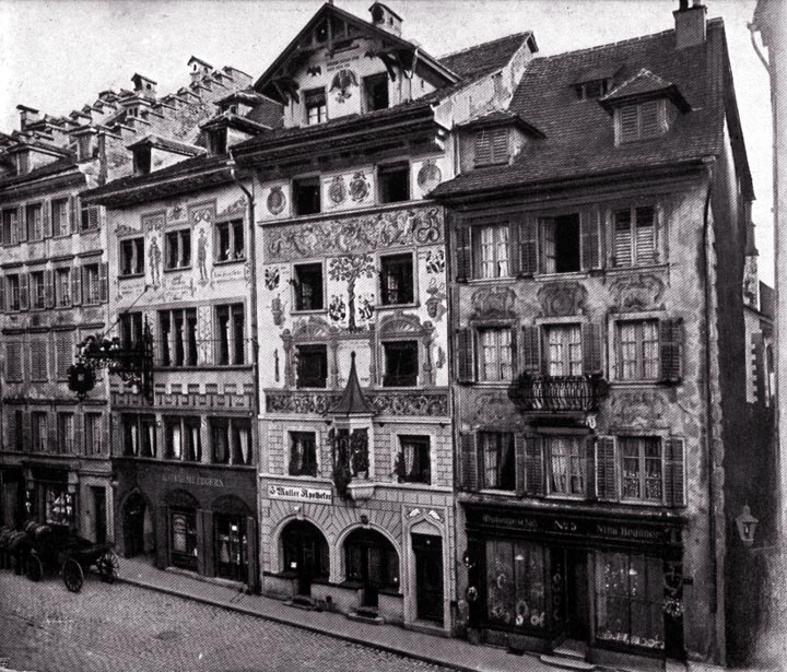
This is classic French urbanity. While these buildings are not extremely elaborate, the one on the left is nicely detailed in good stone. The one on the right is simpler but makes use of stone for window sills and lintels. Both buildings appear to have four inhabited stories. The shutters all appear to work, and many have been closed. (In summer, shutters can help keep a building cool.) Notice that the entrance is only two steps above the sidewalk, which keeps the ground floor well connected with the street. The ground-floor windows in the building on the right are lower still, which suggests that there is only one step between the sidewalk and the entrance, an even better condition. Many people may not like to live so exposed to passers-by (although in the Netherlands it is considered unusual in to close off the view into one's living room with curtains). In general, in cities, I think it a better choice to put commercial enterprises on the ground floor. What must be avoided at all costs is to separate the building from the street by imposing a blank wall on the ground floor. This is quite often done today and is a real insult to the street. A more subtle form of abuse is to raise the ground floor a meter or more above the sidewalk. This, too, is commonly seen. While it provides considerable privacy for those inside the houses, it degrades the quality of the street. Since we are unlikely to obtain agreement on all these matters, it is probably necessary to build different neighborhoods to different standards, so that everyone can find a comfortable neighborhood in which to settle.
|
 Next City Design Home
E-mail |